For the second season of Tonhain Kollektiv, “Resist! – The Sound of Defiance”, Berlin-based graphic designer and artist Sun Ho Lee worked closely with Tonhain Kollektiv chairman Benjamin Lai to develop a striking and multilayered visual identity—a portrait of resistance that translates sound into image.
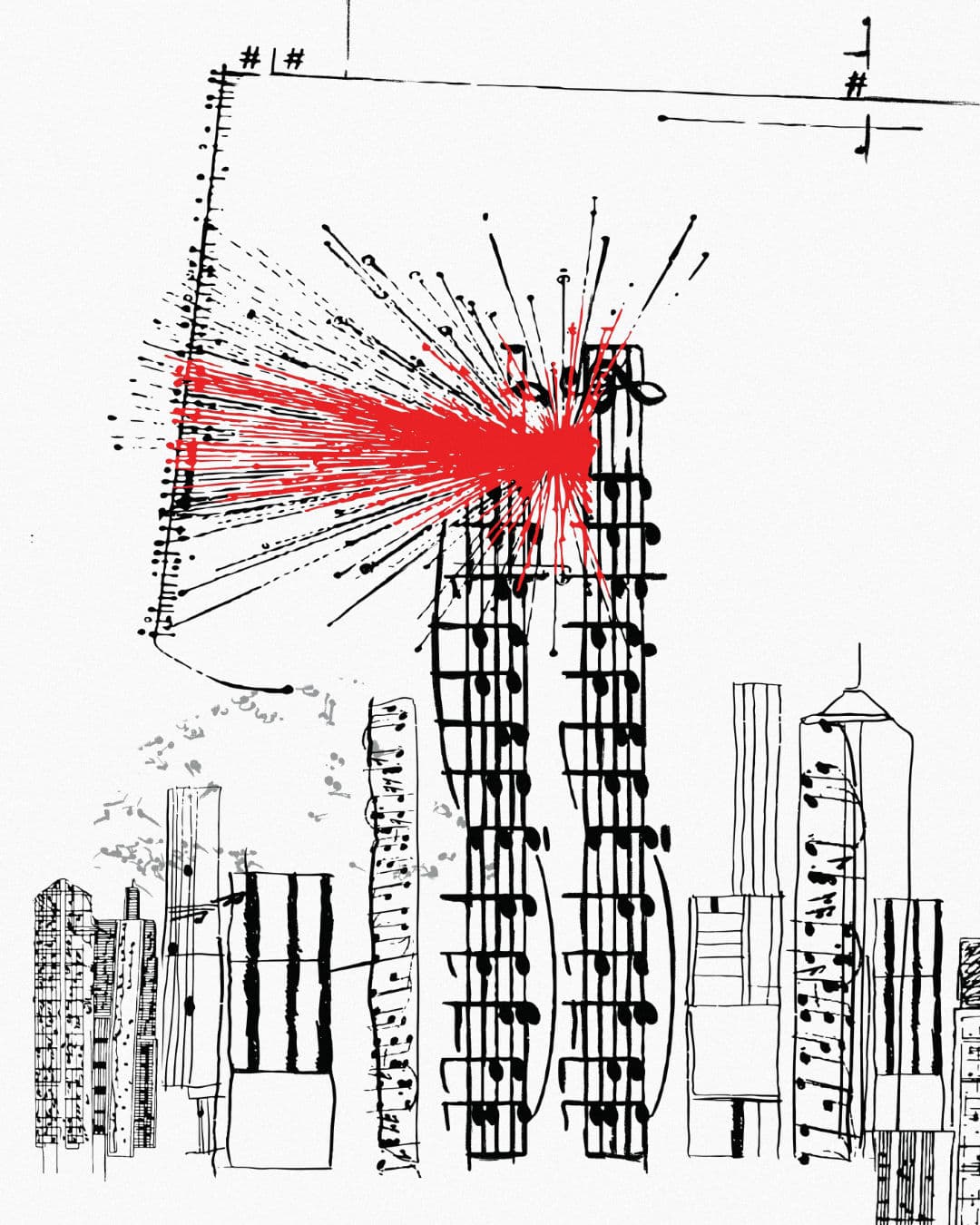
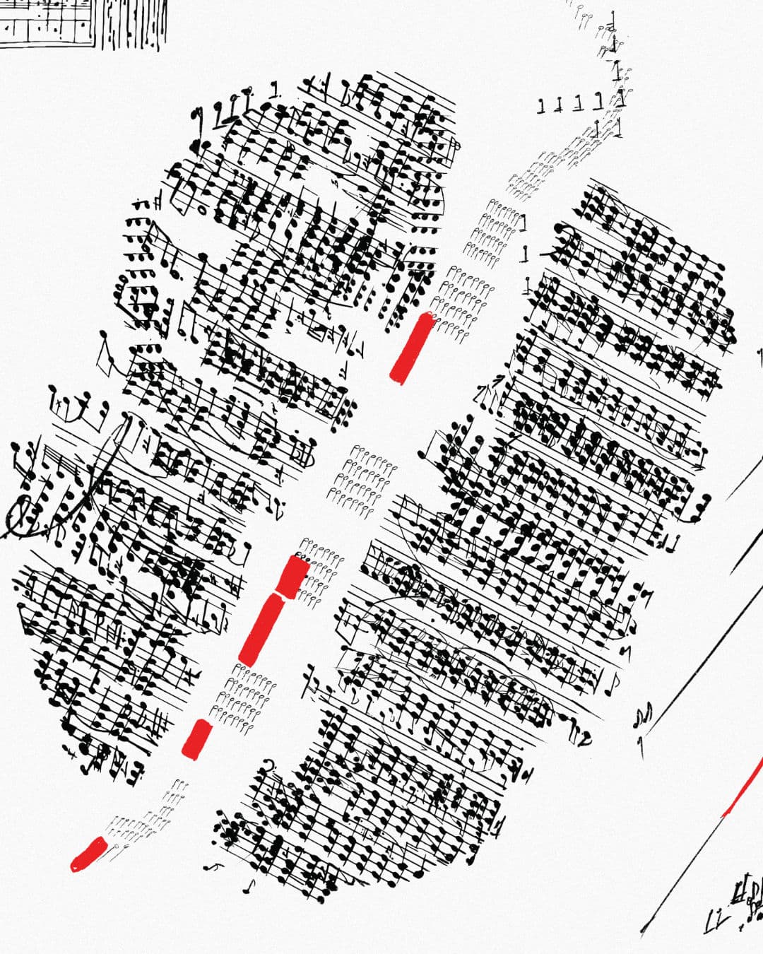
The spark for the concept came during a meeting when Tonhain Kollektiv board member Rainer Crosett noted that George Crumb’s Black Angels—a protest piece written during the Vietnam War—visually resembles its own subject: black attack helicopters, ominous and insect-like. This idea—that a score might mirror the meaning of the music—became the conceptual ignition point.
George Crumb, Black Angels (1970)
Crumb himself believed in this powerful connection between sound and notation. He once referred to notation as his “sole parallel talent to composing,” describing it as “musical calligraphy”. As he told an interviewer in 2016: “I just think music should look the way it sounds.”
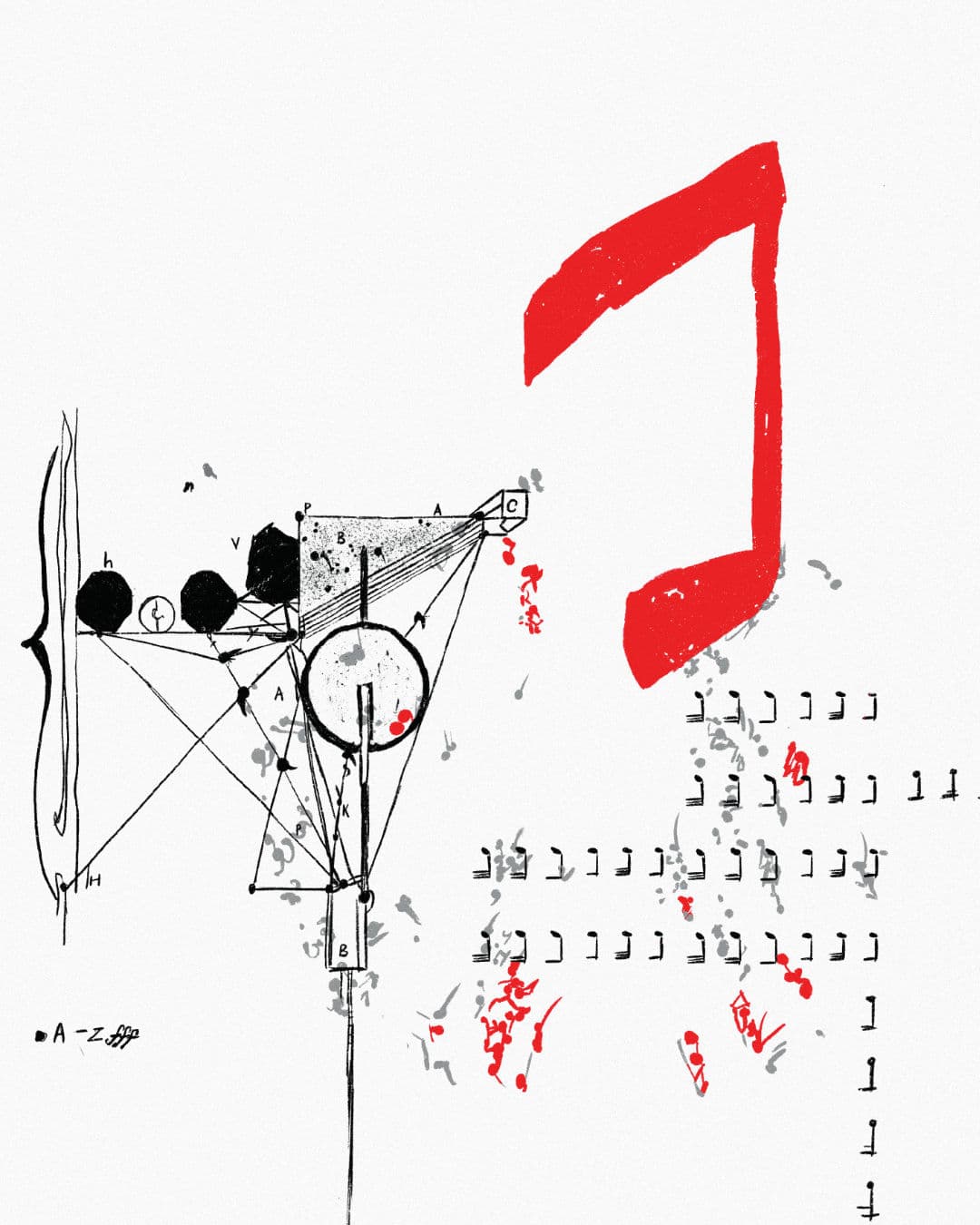
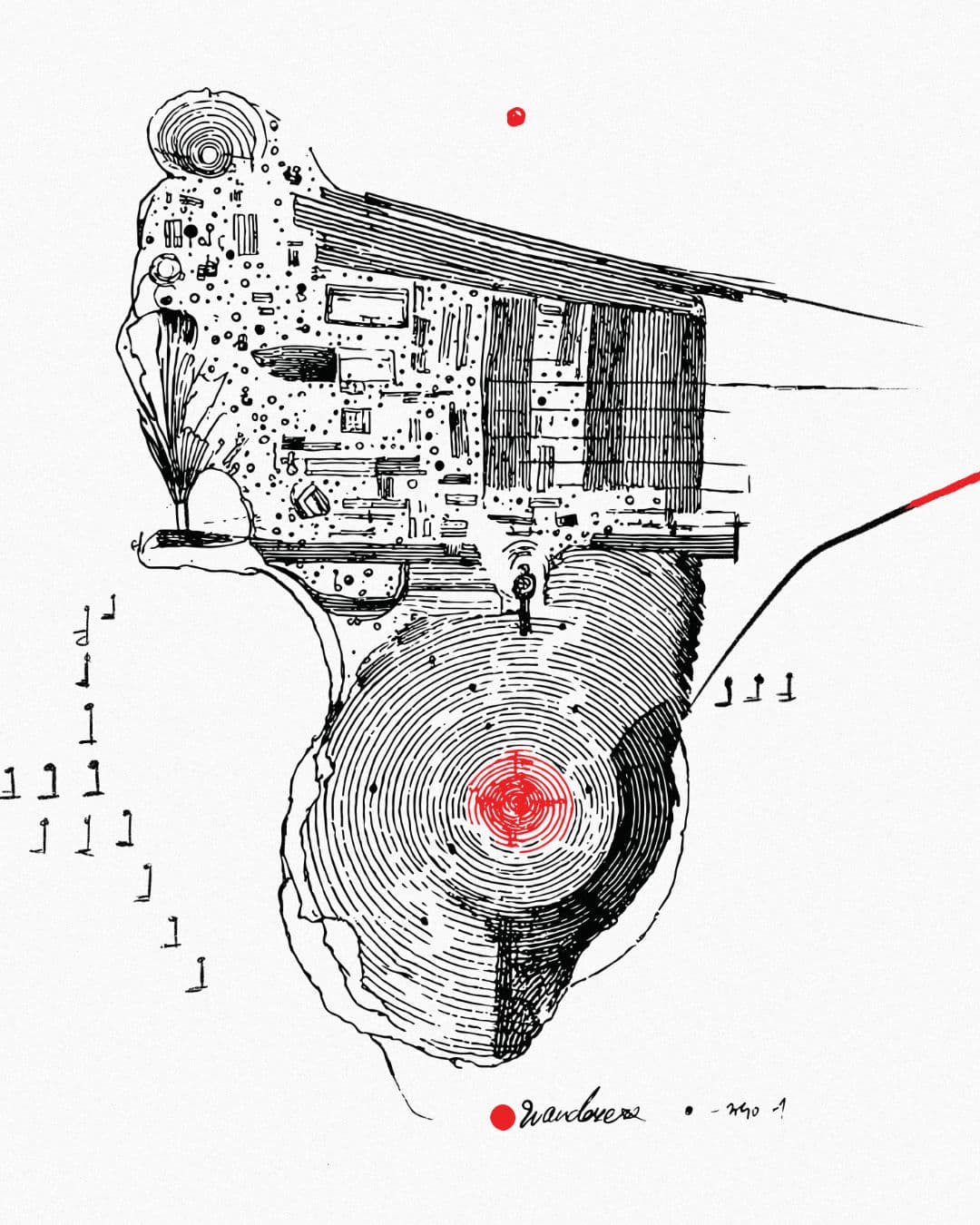
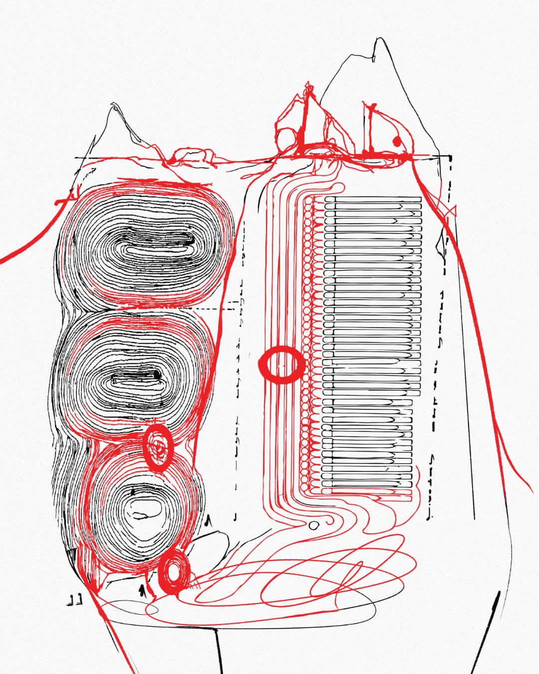
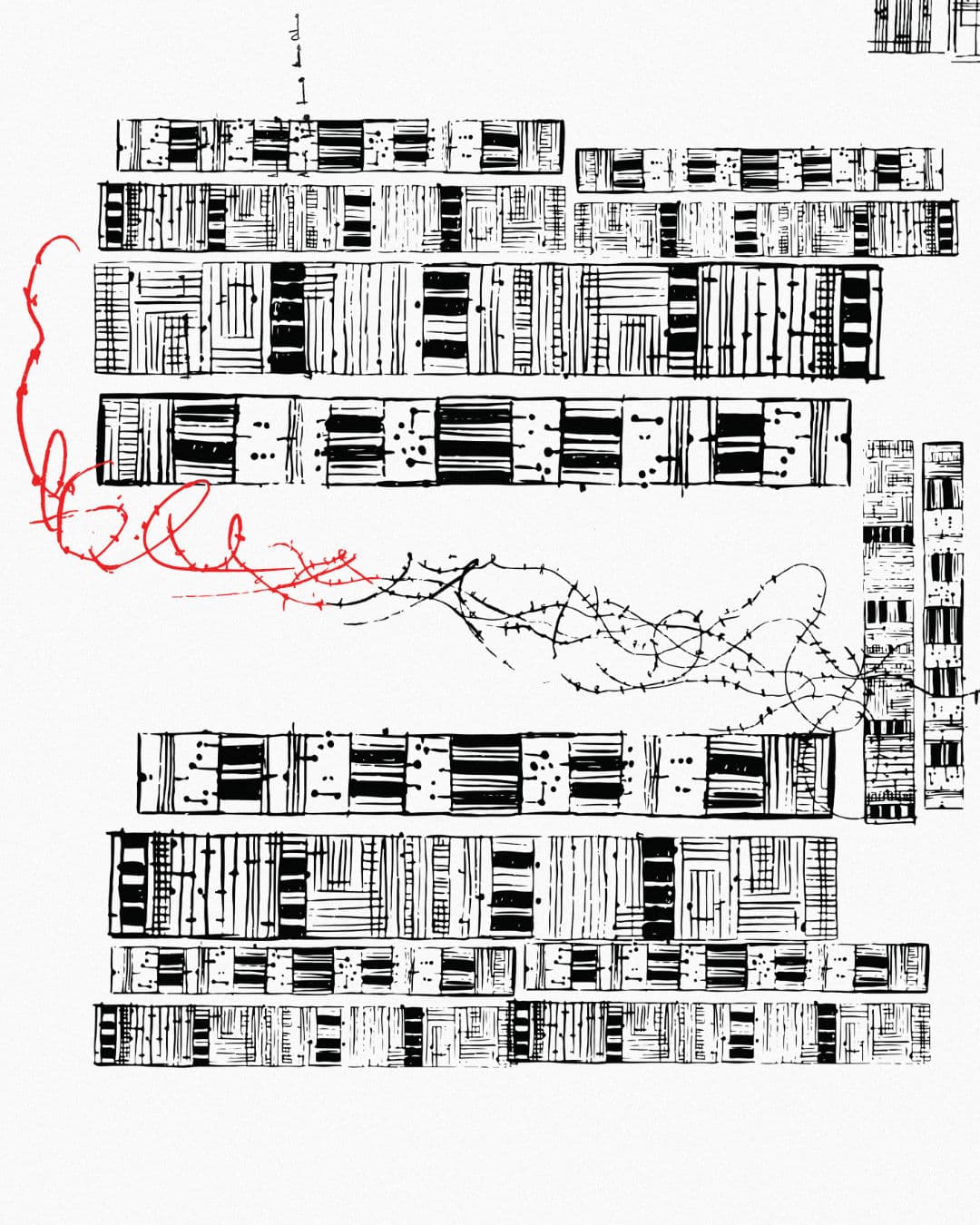
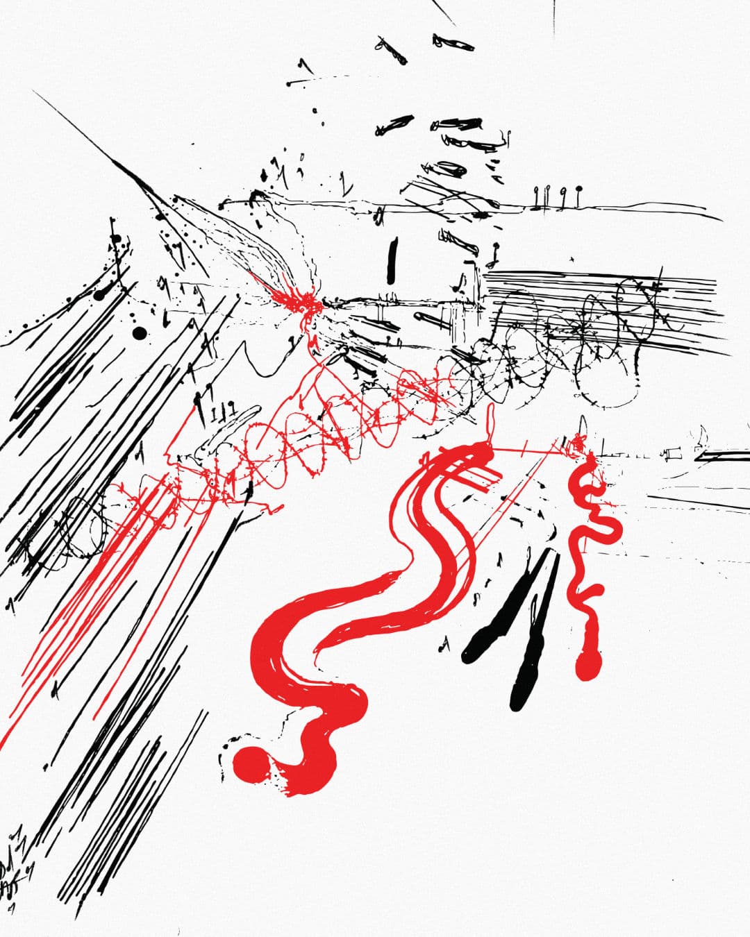
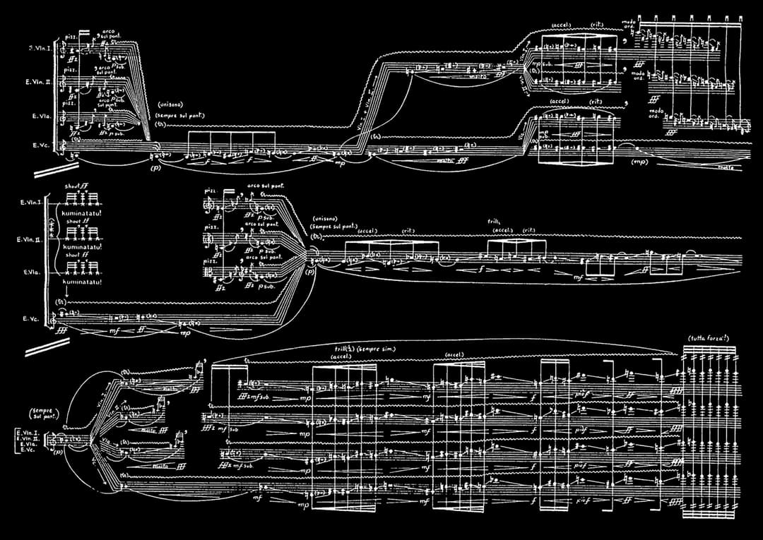
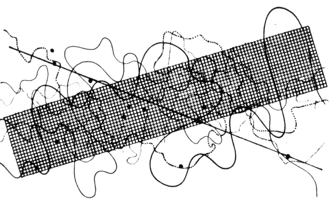
From there, Benjamin and Sun Ho explored the world of graphic notation, drawing from the radical visual scores of Iannis Xenakis, Morton Feldman, John Cage, and Tōru Takemitsu, among countless others. The goal was ambitious: to create an artwork that reflects the emotional, historical, and conceptual layers of each individual concert—while also forming a unified Gesamtkunstwerk, a total artwork representing the season as a whole.
John Cage, Fontana Mix (1958)
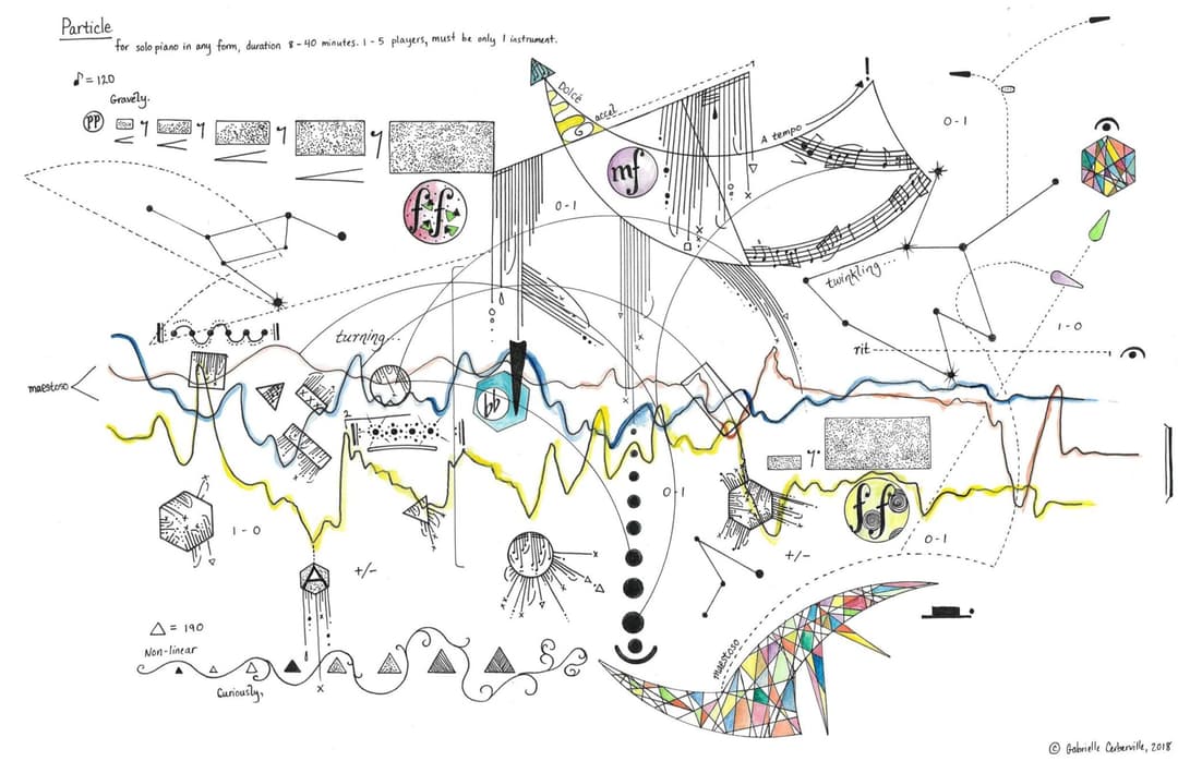
Gabrielle Cerberville, ‘Particle’ for solo piano (2018)
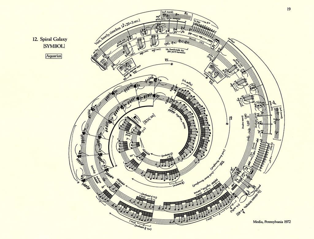
George Crumb, Spiral Galaxy (1972)
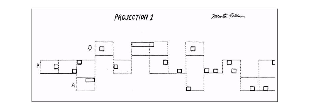
Morton Feldman, Projection 1 (1950)
Roman Haubenstock-Ramati, Konstellationen (1972)
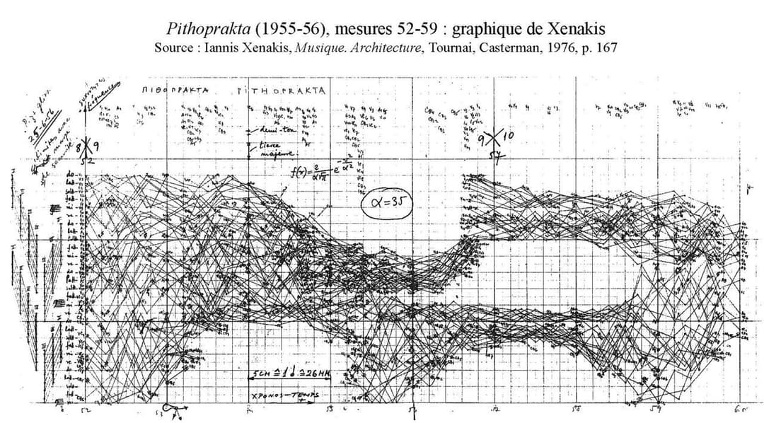
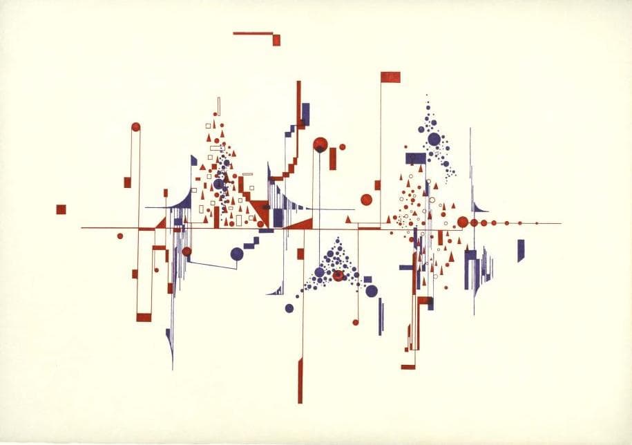
Iannis Xenakis, Pithoprakta (1956)
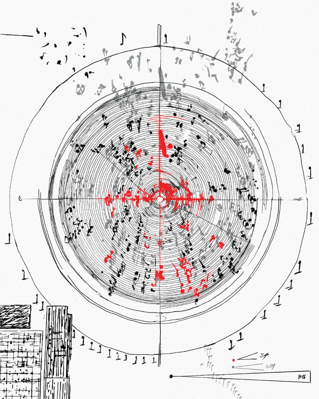
Inspired by the untranslatable German concept of a Wimmelbild—a dense, detail-rich panorama akin to Where’s Waldo? or a painting by Hieronymus Bosch—each of the nine concerts is depicted as a vivid vignette within a larger, bustling tableau of sonic resistance. Echoing the structure of a traditional Advent calendar, each scene is initially concealed, to be revealed one week before the corresponding event.
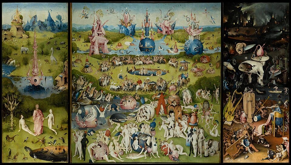
Hieronymus Bosch, The Garden of Earthly Delights (c. 1490-1510)
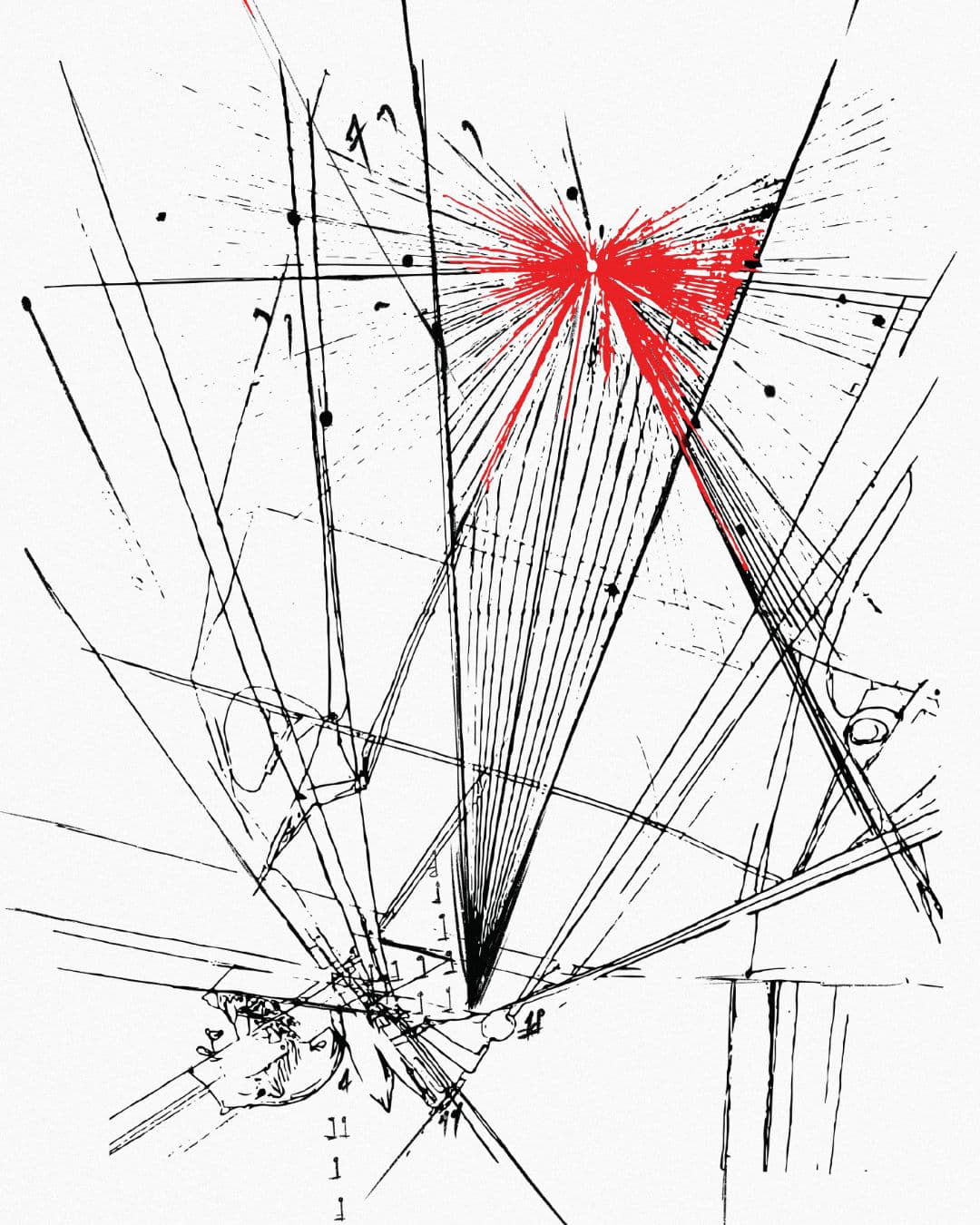
But the mask is not fully opaque. Taking inspiration from IKEA renovation fences—temporary walls with peepholes offering sneak peeks into work-in-progress areas—Sun Ho designed a visual screen that both hides and reveals. A bold red mask overlays the full artwork, torn open by the negative space of the word RESIST!. The brushstrokes resemble ruptures in the surface, slashes in the status quo—offering glimpses into the chaotic beauty beneath.
The color red—long associated with protest, revolution, and urgency—dominates the visual theme. The title font, hand-drawn and raw, flirts with the aesthetics of horror. And rightly so: resistance, across history, is often written in tragedy, bloodshed, and unspeakable sacrifice. But to resist is not only to confront fear—it is to imagine change, to reclaim power, and to shape the future with courage and creativity.